What’s the skinny MSN?
Ethan Marcotte is puking over Microsoft’s new “Windows 8 MSN” homepage. You see Ethan coined the term “Responsive Web Design” (RWD for short). What is RWD? It is an approach to web design where the goal is to provide an optimal viewing experience to all visitors. This works beautifully on many sites, but Microsoft has got it ALL WRONG with their MSN redesign.
Let me show you what I’m talking about. You can only see the new Windows 8 MSN site, well on Windows 8 with Internet Explorer 10. It has to be that combo, other browsers don’t seem to work even if you are on Windows 8.
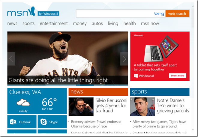
Ok, here’s the site when viewed from IE10 on the Windows 8 desktop. Looks like a Metro “Modern UI” app, which depending what you think of big colored blocks, could look nice or ugly. Anyway, here it is:
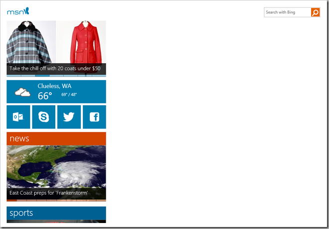
 That’s at a window size of a little over 970 pixels. Now for fun, let’s see what it looks like if I shrink the window down a bit. Based on the principles of RWD, the site should provide an optimal viewing experience. What do you think?
 Awesome, huh? Now that screenshot was taken with the window width being 970px. So optimal. Now I can see the site on 1/3 of my window. I guess I’m only supposed to view the site on a new Surface tablet or a Windows Phone, huh? Screw us that have Windows 8 on real machines? Those of us who need applications other than Office and need more than one window at a time? Way to go Microsoft. This is just embarrassing.
Look, if you want a “mobile” version make the transition at say 480px; 970px is just insane.<]]>
Categorised as: Design, Development, UX